SHELFLIFE stationery set
This self-promoting concept was designed in order to showcase and celebrate the strength, importance, impact and timelessness of conceptual design. The identity was designed as a [food] audit/rating system, whereas the piece evaluated itself on a single axis, and fell somewhere between "perishable" and "preservative." The set was rated toward the "preservative" end of the scale, as it used concept as a primary vehicle for communicating its message, while some other pieces in Mahan's portfolio shifted, usually by project parameters, toward the "perishable," or formal, end of the spectrum. This end is particularly vulnerable to time, and tends to appear dated, or trend-driven. The most successful pieces found an equilibrium between the two, where the piece's form and concept occurred simultaneously and with equal impact.
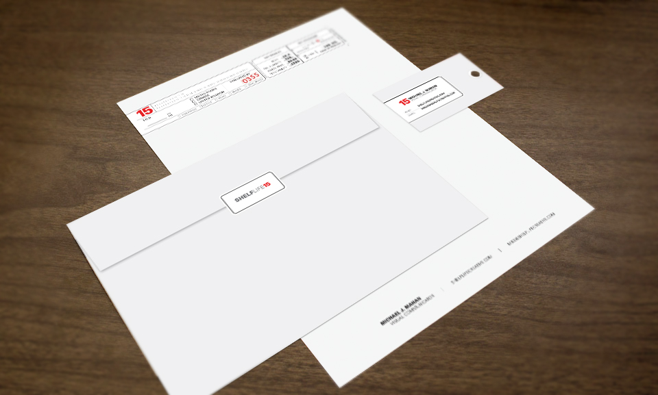
Since its inception, the SHELFLIFE identity has featured a red numeral that updates with each year, becoming its new identity. This signifies the ongoing evaluation/reevaluation of my portfolio pieces; the outcome of which determines the relative success of their timelessness. Since the piece changes annually in support of its own theme, it is produced cost-effectively with a color laser-printed labeling system that gets ganged onto a sheet in duplicate, cut apart and affixed to each component. The body of each piece does not change, and the letterhead's footer can be printed inexpensively and in quantity as a simple black and white laser print. The business card mimics a hang tag used in food audits, complete with reinforcement label.
Client: SHELFLIFE Creative